

How to Plan a Tattoo Sleeve That Feels Cohesive
A sleeve is not a collection of tattoos squeezed onto one arm. It is one long piece of visual storytelling, shaped by movement, anatomy and the parts of your personality you actually want to live with. Knowing how to plan a tattoo sleeve before the needle starts gives the final work purpose, rather than leaving you with disconnected images and awkward gaps to fix later.
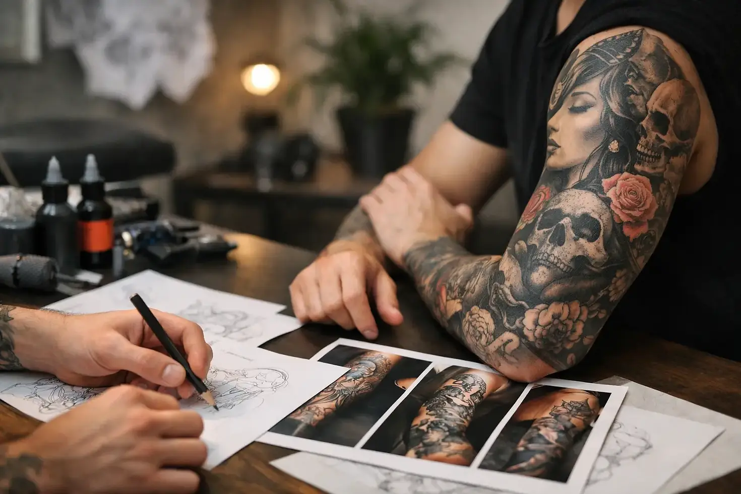
For dark, gothic and illustrative work especially, the best sleeves feel like they have always belonged there. A creature should emerge from shadow, ornamental detail should guide the eye, and every symbol should earn its place. That takes a little thought up front, plus enough trust to let the design develop with the artist.
Start with the feeling, not a Pinterest board
Most strong sleeve ideas begin with an atmosphere. You may be drawn to folk horror, medieval death imagery, occult symbolism, mythology, black-and-grey portraiture, Victorian grotesques or creatures from the deep. That is a useful starting point, but a sleeve needs more than a handful of images you like individually.
Ask yourself what you want the arm to feel like at first glance. Menacing and dense? Ancient and ceremonial? Decayed, romantic and mournful? A strange story unfolding from shoulder to wrist? These descriptions help an artist identify the visual language that will hold the piece together: heavy blacks, fine illustrative linework, smoke, thorned ornament, weathered texture or negative space.
References are still valuable, but use them to communicate mood, composition and detail level, not to request a copied design. Save examples of tattoos, paintings, films, sculpture, book covers and textures. A reference of a candlelit crypt may say more about your intended sleeve than ten unrelated tattoo screenshots.
Choose an anchor image for the sleeve
Every sleeve benefits from a focal point. This is the image that carries the most visual weight and gives the rest of the work something to orbit. It might sit on the upper arm, outer forearm or shoulder cap, depending on its shape and how visible you want it to be.
A large gothic cathedral, skull, witch, mythological figure, raven or horned beast can make a strong anchor because it has enough presence to lead the composition. More personal subjects work too. A specific animal, heirloom object or symbol can become powerful when interpreted through the right dark visual language.
Try not to make every element a focal point. If every section is equally detailed, equally dark and equally loud, the sleeve can become visually flat. Contrast is what makes a design breathe. One dominant image, supported by smaller moments, usually reads far better from across a room and up close.
Think about which way the imagery faces
Bodies move, twist and rest. A sleeve has to work through all of that. Portraits and creatures often sit best where their faces can be read naturally when your arm hangs at your side. Long vertical elements, such as blades, stems, towers or serpents, can help connect the upper and lower arm without forcing the design.
Your artist will consider muscle shape, elbow movement and where the arm narrows. This is why a design that looks perfect as a flat digital collage may not translate to skin. Placement is not an afterthought. It is part of the artwork.
Decide how much coverage you really want
“Full sleeve” can mean shoulder to wrist, but there are several ways to get there. A half sleeve runs from shoulder to elbow or elbow to wrist. A three-quarter sleeve leaves a little space near the wrist or upper arm. Some people prefer a patchwork collection with breathing room, while others want a continuous, immersive composition.
Neither approach is automatically better. A dense black-and-grey sleeve has serious impact and suits gothic imagery beautifully, but it needs planning to avoid becoming a dark mass over time. A more open composition can feel elegant and give linework room to age, though it may not deliver the dramatic full-coverage effect you want.
Consider your existing tattoos honestly. A small unrelated piece does not necessarily rule out a cohesive sleeve, but it may need to become part of the story, be surrounded by background, or be covered. Show it early in the consultation. The more information an artist has, the more intelligently they can build around it.
How to plan a tattoo sleeve around anatomy
The arm has natural stages: shoulder, upper arm, elbow, forearm and wrist. Treating each one as a separate framed picture is a common route to a sleeve that feels broken up. Instead, think of the arm as a surface the eye travels around.
The outer upper arm and outer forearm are often prime spaces for major imagery because they are broad and visible. The inner arm is more private and can suit meaningful details, script or secondary figures. Elbows are difficult terrain: skin folds, moves and takes ink differently. They usually work best with designs that embrace that movement, such as webs, flowers, radial ornament, texture or shadow, rather than a highly detailed face placed directly over the joint.
The wrist is another decision point. Ending before it can give a sleeve a clean boundary. Taking the work onto the hand creates a harder, more committed finish and may affect work or personal circumstances. There is no universally right answer, only the one that fits your life and the piece.
Let background do its job
Background is not filler. It is the connective tissue that stops a sleeve looking like stickers placed beside each other. Smoke, mist, stipple, branches, architectural fragments, clouds, shadow and ornamental motifs can establish depth and guide the eye between larger images.
That does not mean every gap needs packing solid. Negative space is equally useful. A pale break around a face, a clean strip beside dark foliage, or skin left visible behind fine linework gives the eye somewhere to rest. It also helps the main imagery remain readable as the tattoo settles and ages.
If you already have several tattoos on one arm, background can often be the bridge. But there are limits. Some gaps are too narrow for meaningful detail, and some styles cannot be forced together without looking confused. A good artist will be direct about what can be unified and what may need a different solution.
Build a brief your artist can actually use
You do not need to art-direct every millimetre. In fact, the strongest custom work usually comes from giving an artist a clear creative framework, then allowing them to solve the visual problems.
Bring a concise brief that covers four things:
Your core theme or feeling, such as folklore horror, death and rebirth, or decaying religious imagery.
The images or symbols that matter most, with a note on why they matter.
The style and level of darkness you are drawn to, supported by a small, focused set of references.
Practical details, including existing tattoos, desired coverage, deadlines, budget and any areas you do not want tattooed.
It also helps to say what you dislike. If you do not want realism, mandalas, bright colour, excessive floral work or overly clean geometry, say so. Clear boundaries are useful. They leave more room for the artist to make the design personal rather than generic.
Plan for time, money and healing
A sleeve is rarely a single appointment. Larger custom work is usually built over multiple sessions, often spread out to allow healing and fit around real life. The exact number depends on scale, detail, placement, your skin and whether old work needs incorporating or covering.
Avoid planning sessions too close to a beach holiday, a demanding physical event or a period when you cannot protect healing skin. Sun, friction, swimming and poor aftercare can compromise fresh work. If the sleeve has a meaningful deadline, begin earlier than feels necessary.
Budget matters too. Choosing a smaller, well-composed project is better than rushing into a full sleeve with no room to finish it properly. You can plan a full-arm story and build it in chapters. The key is making sure the first section has a natural route into the next.
Leave room for the artist’s eye
The point of commissioning custom tattoo work is not to receive an exact copy of a reference image. It is to get something designed for your body, your idea and the artist’s particular hand. At Neef Tattoos, that is where a sleeve gains its character: the reference points become a darker, more considered piece rather than a familiar design repeated on another arm.
Be decisive about the feeling and the non-negotiable elements. Be flexible about the exact layout, transitions and supporting details. Those are often the choices that turn a good concept into a sleeve with real flow.
A well-planned sleeve should still feel like you years from now, even when your tastes have grown and shifted. Start with the images that have weight, give them space to exist, and let the arm itself tell the artist where the story needs to go.


