

Illustrative Tattoo Sleeve Guide for Dark Art
A sleeve is not a stack of separate tattoos squeezed onto an arm. It is one moving image, shaped by muscle, joints, negative space and the way your body naturally turns. This illustrative tattoo sleeve guide is for people who want something darker, stranger and more personal than a collection of disconnected flash.
The strongest sleeves do not need every inch to scream for attention. They have a clear visual language, moments of density and enough breathing room for the artwork to age with impact. Whether your references live in folk horror, medieval grotesques, occult imagery or mythology, the goal is the same: make the whole arm feel intentional.
Start your illustrative tattoo sleeve with a world
Before choosing individual subjects, decide what world the sleeve belongs to. A gothic cathedral, a cursed forest, a plague-ridden village, a mythic underworld or a Victorian cabinet of horrors can all hold very different imagery together. This is more useful than arriving with ten unrelated reference pictures and asking for them to be joined up.
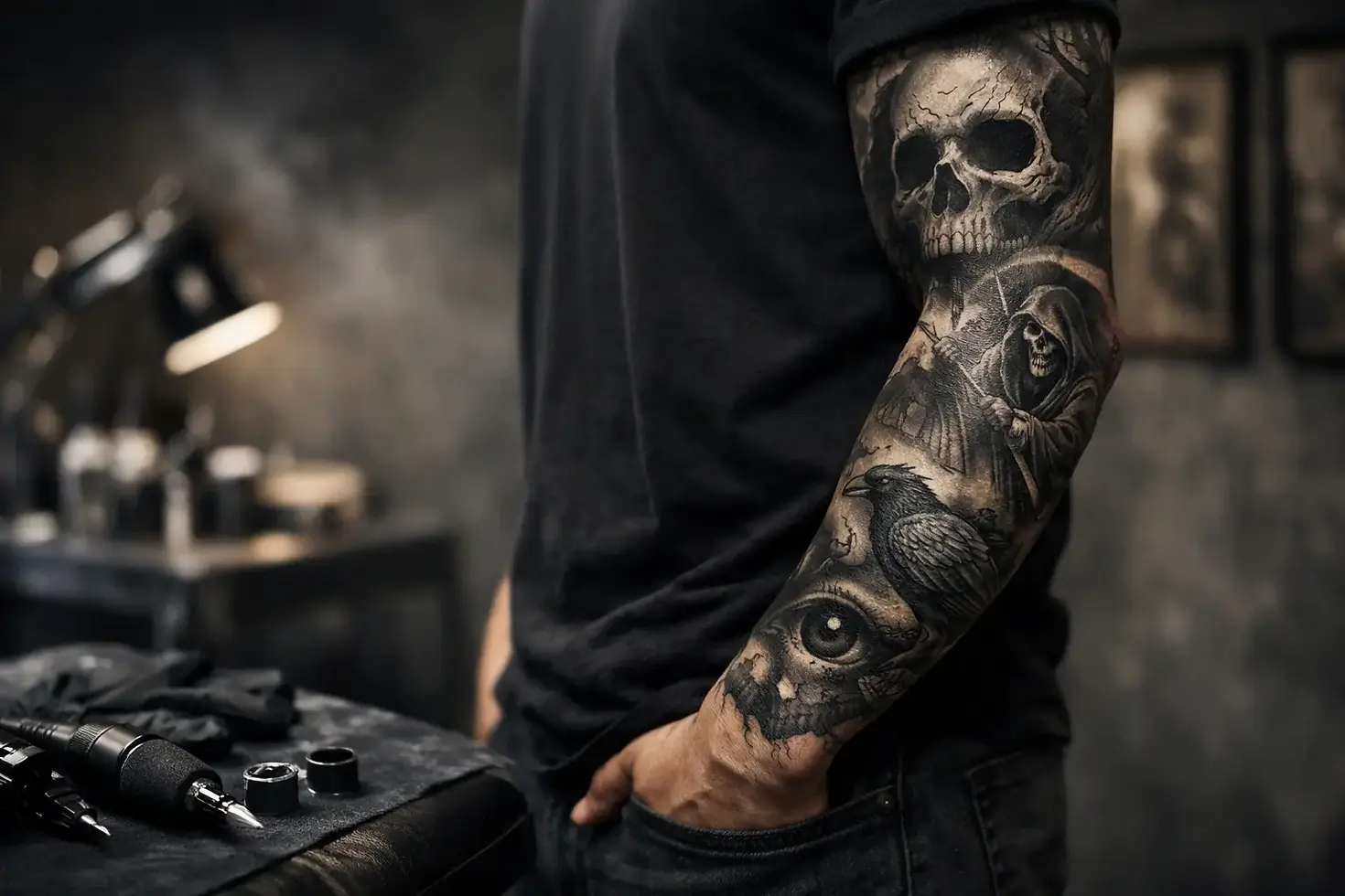
A sleeve can be built around a narrative, but it does not need to tell a literal story from shoulder to wrist. Often, an atmosphere is stronger. A raven, a hooded figure, thorned branches and an old stone arch can feel connected when they share the same mood, textures and visual weight.
Choose a main image first
Every sleeve benefits from a focal point. This may be a large figure on the upper arm, a skull or creature on the outer forearm, or a piece of architecture running through the bicep. It gives the eye somewhere to land and prevents the design becoming a busy wall of equally loud details.
Think about what you will still want to look at from across a room. Tiny symbols and hidden details are great, but the main subject needs to read clearly at a distance. In illustrative work, a powerful silhouette usually matters more than cramming in another decorative object.
Build a visual hierarchy
Once the focal point is set, supporting imagery can create rhythm around it. Secondary images might be candles, blades, bones, roots, smoke, insects, carved stone or ornamental frames. They should add depth without competing with the main piece.
This is where custom design earns its place. A wolf from one reference, a church window from another and a favourite lyric are not automatically a sleeve. They need to be redrawn as part of the same composition, with matching linework, shading and scale.
Design for the arm, not a flat page
An arm is not a poster. It narrows at the wrist, rounds at the shoulder and bends sharply at the elbow. A good sleeve uses those changes instead of fighting them.
Outer forearm placement is ideal for images you want people to see easily: faces, animals, weapons, masks and strong graphic symbols. The inner arm is more private and can suit text, finer details or imagery with a more intimate meaning. The upper arm offers broad space for a major composition, while the wrist is best treated as an ending rather than an afterthought.
When you move your arm, the artwork should still make visual sense. Branches can twist around the limb, fabric can fall with the contour of the bicep, and smoke or shadow can guide the eye through a transition. Those connective elements are not filler. They are what turn separate areas into a sleeve.
Respect the elbow and ditch
The elbow is a difficult surface because it moves, folds and wears differently from the rest of the arm. Heavy solid black directly over it can heal unpredictably and may need more attention over time. Fine detail can also be lost in the movement.
That does not mean the elbow must be left blank. Radial designs, webs, ornamental forms, thorns, bone structures and textured shadows can work brilliantly there. The elbow ditch is sensitive and prone to fading, so it is usually better suited to flowing transitions than the central face of your favourite creature. Placement should serve both the design and the skin.
Let black, skin and detail do different jobs
Dark illustrative sleeves rely on contrast. Black areas create drama and push lighter details forward. Skin breaks stop the sleeve becoming a murky grey mass. Fine linework brings character, but it cannot carry the whole design alone.
A common mistake is asking for maximum detail everywhere. Aged tattoos need structure. Large areas of black, mid-tone shading and open skin need to sit beside one another so the image remains readable years down the line. The exact balance depends on your skin tone, the style of the piece and how much blackwork you want to wear, but contrast should be planned from the start.
Do not mistake negative space for unfinished skin. In a properly designed sleeve, it can become moonlight behind a figure, fog between trees, a sharp break around a skull or a calm area that makes the darker sections hit harder. It is composition, not empty space waiting to be filled.
Plan in sessions, but keep the long view
Most sleeves are built over multiple appointments. That gives the design time to develop and lets you live with the direction before every section is complete. It also means healing, budget and pain tolerance need to be part of the plan rather than awkward surprises halfway through.
There are two sensible approaches. You can design the entire sleeve before the first session, giving every element a fixed role. Or you can create a strong anchor piece and leave considered routes for the next stages. The first approach offers total cohesion; the second gives you more room for new ideas. Neither is automatically better, although both need a clear visual framework.
Try not to book a large shoulder piece, then decide months later that you want an unrelated forearm tattoo. If a full sleeve is your aim, say so at the beginning. Even if the work is completed gradually, the artist can protect useful space, carry textures through the arm and avoid painting the design into a corner.
Avoid the patchwork effect
Patchwork sleeves can be brilliant when that is the deliberate aesthetic. A dark illustrative sleeve is different. It usually needs continuity in line weight, black saturation, shading style and imagery.
Problems tend to appear when every available gap is filled as soon as it appears. Small standalone motifs may solve a short-term empty space but make a future composition harder. The better move is often to wait, take stock of the arm as a whole and use a transition that belongs to the existing work.
Be wary of overly literal symbolism, too. A sleeve does not need to explain every part of your life to everyone who sees it. Personal meaning can sit beneath the surface. A particular bird, myth or object may mean everything to you without needing a paragraph of text beside it.
What to bring to your consultation
Bring references for mood, not just finished tattoos you want copied. Film stills, old book illustrations, album artwork, architecture, paintings, textures and photographs can reveal far more about your taste. Point out what you respond to: the heavy shadows, the grotesque faces, the scratchy linework, the symmetry, the sense of decay.
It also helps to be honest about the practical side. Say which areas you want visible, whether you work in a setting with dress restrictions, how much existing tattooing is on the arm and whether you are committed to full black backgrounds. A custom artist needs those details to make choices that will work on your body, not just on a screen.
At Neef Tattoos, the aim is not to force your idea into a pre-set formula. It is to find the darker visual thread running through your references and turn it into artwork that belongs on your arm.
A sleeve worth wearing is allowed to take time. Give the design room to breathe, let the strongest image lead, and choose details because they deepen the world you are building - not because there is a gap that needs filling.


